join the mailing list
* indicates required

Tuesday, December 22, 2009

Gold:Silver Ratio

Though we still need confirmation over the next few days, notably tomorrow, it appears that gold and silver have probably bottomed out.  If that's the case, then looking into the gold/silver ratio will point out which asset is likely to better perform over then next intermediate period.

This chart of the last 10 years of the gold/silver ratio is of particular interest at this point.  The chart is divided into roughly 4 sections: 2000 - 2003, 2003 - 2007, 2007 - 2009, 2009 - present.


The red line is the gold/silver ratio.  The gold line is the gold price, and the silver/gray line is the silver price.  

The long term trend is bullish for both gold and silver as can be seen by the general uptrend of both lines.  The gold/silver ratio, however, is characterized by longer term periods where either gold is rising faster than silver (when the longer term trend is moving up) or silver is outperforming gold (when the longer term trend is moving down).

The longer term trends are showing with the blue channel lines bordering the higher and lower ratio ranges.  The longer term trends are made up of intermediate term oscillations.  During a given longer term trend, gold outperforms, then silver follows.  If you'll take a look at the current longer term trend that started in 2009, you can see that silver has generally outperformed (the general trend is down for the ratio), and currently, we're near the top of the channel (meaning gold's outperformance in the intermediate term is likely at an end).  Assuming the longer term trend is intact, and we believe it is, then it is likely that silver will dramatically outperform gold for several months before gold takes over the leadership--likely next fall.  Longer term views of this chart show that the longer term trend remains intact, typically, for 2-3 years at a time.

Read more...

Gold Bottom Fast Approaching or Euro Going the Way of the Dodo?

The euro is getting absolutely massacred, driving the dollar up and gold down.  Badly.  Enough to completely wash out the weak hands, in fact.

Going out on a limb, we're going to attempt the most foolish thing one can attempt--calling the bottom of a massive sell-off.  Don't bet anything on this call.  Catching a falling knife is a fool's game.  Instead, look for a confirmation of a bottom by a turning dollar, a supported euro, and a little time with gold consolidating at a given level.  That's the only way to be sure.  But, in the spirit of holiday vigor, we're going to lay odds that today is the spike low bottom, occurring at or near the 1072 level.

We'll update the market situation more tonight.  Go study up on some mining companies...

Read more...

Monday, December 21, 2009

The Turn in Gold and Gold Stocks is Looming

Note how strong that most commodities have been acting even though the dollar has been on a strong, sharp rally.  That did NOT happen during the credit crisis.  This dollar rally has all of the earmarks of an intervention--it does not appear to be fundamentally driven.  In fact, today the US markets did quite well even though the dollar broke above 78.  Even the energy complex, notably oil, has generally been rising.  There are certainly no signs of a credit crisis or panic in the air.

Today, only one chart.  This one should say enough.


The HUI has basically been running within the channel it has set since the beginning of 2009, and we're quite near the bottom of the channel.  Gold is quite oversold now.  The dollar is quite overbought.  Look for a pullback to the trendline at the lower end of the channel near 400 and a turn up, even if gold is down for the day.  That should mark the turn for gold and gold stocks.  Be sure to review some of the relative performance charts we posted last week and do some homework over the holidays.  Gold investors may get the gift of heavily discounted gold before the end of the week!


Read more...

Friday, December 18, 2009

Dollar and Gold Market Update - A Look at the History of Dollar Countertrend Rallies and the RSI

We're going to start today's post a little differently by looking at our record--the good and the bad--as it applies to this move in the dollar and gold so as to set the stage for the purpose of this post on what to look for in a dollar turn based on its actions in the last 10 years of the bear market.

Note that we started talking about a need for gold to sell off technically, on November 4 with a need to consolidate near the 1100 number, or possibly as low as 1070.  Of course, this call was early, but now that we're working around that number, it seems to make sense, right?  By November 5, we were talking about sell signals on gold and the need to take profits.  By November 10, we were discussing the long term (primary) trend and warning that gold needed a correction in the short term, and that if it didn't correct then, there would be an intermediate term correction of a higher than normal magnitude coming.  By November 18, we discussed how gold was moving euphorically even as the euro did not confirm the move by failing to break 1.50 against the dollar.  By November 20, we were looking at the bullish and bearish cases on the euro to determine what direction things were going, and commenting on the ECB talking the euro down.  On November 25, we discussed that either gold was frothy or the dollar was about to take a nosedive--confirming we believed that gold was big time frothy.  On December 4, we discussed the gold correction underway but did not believe the dollar would break its 50 day moving average (should have trusted our own advice more on that one).  We also incorrectly believed that the euro would find support earlier than it has, but that was before all of the Greek default talk.  On December 7, we postulated that this could be a currency intervention (we still tend to believe that given the magnitude of the moves).  On December 11, we looked at key currency support levels, which frankly, haven't held as well as we'd believed it would.  We also commented on gold moving into the range for traders, which is still the case, noting that the 1100 area was solid with a possible breakdown as low as 1070.  Again, going back to the beginning of November that a consolidation must take place at 1100 or so.  Fast forward a month or so and here we are.  During that month, it was certainly concerning that we may have blown some calls, but in the end, the charts don't lie.  In summary, we've been right on in knowing there had to be a gold consolidation, and by proxy the US dollar must have at least "stood still," but we underestimated both the gold buying euphoria and the level of the dollar move up.  That's something we hope to correct today.

This brings up one key area in the realm of traders vs. investors.  Investors, which are simply traders with longer time horizons from our perspective, should be focused on the primary trend and should not be concerned with getting the absolute bottom of a move--just a good value.  The reason, of course, is that the closer one tries to call a bottom or top, the more likely the call is wrong.  A trader needs to not only get a trend right, but he must get it right in many different time horizons and get it right repeatedly in order to profit.  Essentially, his risk is higher as he has to enter and exit more trades, and thus get more decisions right.  It's a trickier game, but knowing the techniques can help make even long term investors make better decisions.

Let's get into it.  This was originally going to be part of our gold report since the dollar and gold are so tightly linked.  The problem, however, is that we can't seem to get the gold report out the door.  So instead, we'll summarize the dollar section here, and as we near a bottom, we'll follow up with the key gold analysis.

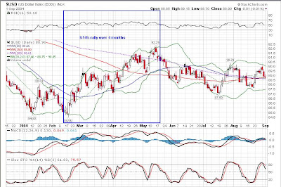
First, a history of the dollar in chart form since the beginning of the bear market.


This is a daily chart, and as such, it's quite crowded.  It's obvious, however, that the general trend (primary) since late 2001 is down (coinciding roughly with the bottom in the gold price). That trend should hold until fundamentally, the US gets its fiscal house in order--or the currency goes bust--whichever comes first.

That primary trend is made up of oscillations of small, medium, and large sizes.  That is, nothing goes straight up or down, so during the primary trend there are periods where there is a countertrend of various periods--months, weeks, and days, if you will.

Then next few charts will make this more evident.  First, the long term trend--down.  Again, this is driven by fundamentals.


Within any long term trend, there are countertrends.  We're going to use the term "longer term" to imply the smaller periods (trends, waves, whatever you want to call them) that make up the primary trend.  In other parlance, it would be called the secondary trend or countertrend (whenever it goes against the primary trend).  In essence, it's not the long term, fundamentally driven move, but instead it is the "next size down" series of moves that make up the long term trend.  The rallies that go against the primary trend are the secondary or counter trend rallies.


The following are what we'll term "intermediate term" moves.  Colors changed from blue to red to make it easier to see...  Basically, just as the long term trend is made up of smaller periods we're terming the "longer term," so then is the longer term made up of yet smaller moves called "intermediate term" periods.  All of these periods are also commonly referred to as "waves," but we're avoiding that term because it is often used by a specific school of technical analysis called "Elliott Wave Theory."  We don't want to create confusion as if we're referring to their technique.


Of course the intermediate term moves are made up of short term moves.  In a 10 year chart, there are simply too many to point out.  But you probably get the idea by now.

Note that we're really trying to break this down to be more granular and specific than most.  In most cases, analysts refer to the short term, intermediate term, and long term.  However, each analyst has a slightly different definition of what that means.  For our purposes, we're let the fundamentals drive the long term.  The monthly charts confirm the long term and help define the longer term.  The weekly charts define the intermediate term (with input from the monthly charts), and the short term will be defined by the daily charts (with input from the weekly charts).  Sound confusing?  It will become clearer as we move along. 

Our primary means of investing is to invest in accordance with the long term trend, but to avoid the secondary (longer term) counter trend rallies by either changing assets or, in some cases, shorting the primary trend.  We anticipated that the dollar would hit a longer term rally (a counter trend rally lasting several months that would be sharp and damaging to gold prices, in particular) in late Q1/2010 or early Q2/2010.  There are several fundamental factors for that time period as well as technical indicators that have been trending to "go off" around that period since this March.  However, we *may* be on the cusp of that longer term countertrend rally now.  The key in watching the dollar is to determine if we are, indeed, entering a significant countertrend move, or if this move is more of an intermediate or short term move.

To summarize our position in the dollar and gold markets, at this stage, we believe we're seeing an intermediate term move--one that will last maybe 4-6 weeks, of which 2.5 are already behind us.  Initially, we believed we'd be seeing a move of a couple of weeks at most, but we've understimated the weakness in the euro, and are still under the belief that we are probably witnessing a currency intervention timed for near the end of the year when gold prices were strongly overbought and the dollar was under significant pressure.  Why?  There are several factors, in fact, but perhaps the most important was is that this market has been trading very technically for a long time now, probably due to the dramatic rise in the computer-based trading instead of long term fundamental investing (hence the dollar vs. all assets in the world has been a theme even when the fundamentals don't support that in all cases).  Given that, then we can look at one very important piece of information--the dollar has never had a major (longer term/secondary/counter trend) rally when it was not oversold on at least the daily and weekly charts, and at times the monthly charts.  Never.  Not once.  Yet this time, all of the activity began occurring when the dollar was not oversold, but gold was overbought.  Combine that with data from the Exchange Stabilization Fund, the time of the year (holiday season), the negative dollar press everywhere, the ECB talking the euro down and the dollar up, the Bank of Japan talking the yen down and the dollar up, the positive press on gold, etc and you have a formula for the perfect time to intervene and manage market perception going into Bernanke's confirmation when there were signs all over that the trend from March was slowing.  Coincidence?  Only if you believe that we have free markets....

Nevertheless, here's a fact (and the number one reason to include technical analysis in your investing)...though markets are manipulated, that manipulation *must* show up in the price of assets.  There is no way, as an example, for central banks to beat the price of gold down without the price being affected.  While this seems ridiculously obvious, the point is that since we're using price-based analysis, then as the price moves, we should be able to determine the price movement will have on investors, resulting in additional future price movements.  That's the purpose of technical analysis and the reason that fundamentals alone, while they are the most critical aspect of investing, are not enough to navigate manipulated markets.
 
Another important note is deserved here.  No long term trend can develop without longer term trends that develop.  No longer term move can occur without intermediate term moves that become longer move.  No intermediate term move can develop without short term moves.  Everything starts at the daily, short term level and may or may not expand.  Given this condition, calling bottoms and tops obviously becomes a fool's game because the implication is that on any given day, you must know whether or not a given market move is going to be a long term play or not.  It's just not possible.  Our goal, when trading, is simply to determine if trends are changing, and if so, what the duration of that trend may be.  Then move into it once it has actually become a trend.  We'll never get 100% of a trend's move, but we're happy to take 80% of a trend with much lower risk, getting in after it's established and getting out before the herd.

With all of that said and the stage set, then let's look at how well the RSI has forecast the dollar moves in the short, intermediate, longer, and long term and what the history of these moves tells us that could be used to improve our odds of looking into the future.

 The first chart is a 10 year long monthly dollar chart.  There are areas outlined in either red or blue.  The blue outlines denote what we call "longer term" or countertrend moves.


 Notice how those blue boxes outline the countertrend moves so obvious on the chart we posted way above, just copied here for convenience.


In 10 years, there have been two countertrend periods, and both were forecast by the RSI.  Take a look at the monthly chart again.  Notice that the RSI was oversold (below 30) for an extended period of time before both rallies occurred.

There are two red boxes on those charts as well.  They correspond to intermediate term rallies.  You could say they were "false positives" that a longer term rally was coming.  Note that those intermediate term rallies never really moved the RSI from bordering an oversold condition, so in the end, it took a longer term countertrend rally to move the oscillator to the 50 mark (which is an important level on the RSI that separates bear markets from bull markets).  Note that in our latest period, the RSI is not oversold at all.  The trend from March would have put the RSI into oversold in late Q1 or Q2/2010, which was part of the purpose of our thesis about the gold price moving up until that period in time (as the dollar weakened).  Note on this chart that since the dollar entered its bear market in 2001 (which occurred when it topped and was technically confirmed in 2002 when the monthly RSI fell below 50), the RSI has not risen for any substantial amount of time above 50--only briefly and barely during the first major countertrend rally and again when the credit crisis (last rally) fueled the countertrend rally.  We've discussed this issue in the Looking Back at Signs of the Credit Crisis essay and our recent Global Health update.  In short, without credit stress, we do not believe that any countertrend dollar rally can substantially break above 50 on the monthly RSI for any reasonable period of time.  Thus, that 50 mark takes on a different meaning--without an exogenous event fueling a dollar move, any break above 50 for a substantial period is a good technical confirmation of a primary trend change to a dollar bull market due to a change in fundamentals (ie, the US gets its fiscal house in order).  We're not holding our collective breath on that one any time soon.


If we look at the RSI's performance on a weekly dollar chart over the same 10 years, we get a sense of the intermediate term rally picture.  We pick out about 19 intermediate term rallies for the dollar in the last 10 years (counting the current one).  If you used the RSI alone to forecast those rallies when the RSI was oversold only (as shown below), you'd have forecasted 11 of them (58%).  You would have forecasted 100% of rallies of at least 5% magnitude in size.


If you would have used the RSI at every oversold and turn at 50, you'd have forecasted 13 of 19 (68%) and every rally of at least 3%.  That's pretty good for one indicator.  Note that this recent dollar rally was also forecast as the RSI just touched the 30 level on the weekly chart.  That corresponded to the period when we first made the gold call that it was becoming overbought at 1100.

Note that the weekly and monthly charts were both oversold when the two longer term, countertrend rallies occurred.  

Now, this doesn't mean that the RSI is the Holy Grail of technical analysis.  It is very good, though, and the dollar has been particularly predictable with it.  Gold tends to need the slow stochastic, stock markets tend to need an advance/decline, etc.  There is no single indicator that forecasts everything, and they tend to be best as confirming indicators relative to chart patterns.  However, the point here is that the RSI alone can help predict the dollar market, which in turn helps predict stocks, gold, energy and other asset markets.

If we simply take the weekly dollar chart above and examine each of the 10 marked periods on daily charts, you will get a further sense of the magnitude and duration of the dollar moves.  We will leave the close examination to the reader, but here they are in chronological order.  Notice again that these are daily charts, and so you will see the short term moves in greater detail that make up the intermediate term moves.

The first intermediate term move was approximately two months long and made up of three short term countertrend moves of 13, 7, and 8 trading days.  (For those familiar with Elliott Wave Theory, you'll see this  patterns throughout the rest of the discussion).


These next two rallies occurred in a short period of time, so we've combined the view on one chart.  The first rally was a very steep short term rally (of "medium" or intermediate size) of 8 trading days.  Arguably, you could consider the second short term rally to be part of the first intermediate term rally, but since a new low was not set, we have not included it as such.

The second rally was an intermediate term rally of four short term countertrend rallies of 9, 9, 3, and 13 days, respectively.


The fourth rally was made up of 3 short term rallies of 10, 21, and 7 trading days, respectively.  It lasted 4 months.  Obviously, there is some judgment as to how to break up the short term rallies.  This is the most simplistic viewpoint, and 21 trading days is at the far extreme of what we'd term "short term."  In addition, 4 months is about as long term as an intermediate term trend can be.  This one bordered "longer term" in duration and magnitude.  There are no clear cut lines, but about 10% and 6 months would be the maximum "intermediate term" trend in our book.


This next intermediate term rally ("Rally Number 5") became the first longer term countertrend move, lasting 6 months and running to 13%.  Arguably, this is a secondary countertrend move mad up of three intermediate term moves.  Refer back to the monthly chart to see its overall size (which stands out on the monthly chart) and the weekly chart (to see the four distinctive intermediate trend moves, each made up of short term countertrend rallies, as seen below).


The next intermediate term rally was made up of three short term rallies.


The next three occurred close together and are on the same chart.  Notice that in this period, the monthly RSI was still staying in the oversold range, and the weekly RSI was hugging the oversold level (much as occurred prior to the first longer term rally).  These rallies never really removed the oversold condition on the dollar.


The last dollar rally was a throwover from the prior three.  Add in a little credit crisis, and look out!  A 25% move over 6 months that went from a consolidation, to an intermediate term rally, to a longer term rally.


Thus, in 10 years, we have two longer term, counter trend rallies which were predicted by both the weekly and monthly RSI, nineteen countertrend rallies of which all of consequence were predicted by the RSI, and more short term rallies we care to count, many of which were predicted by the RSI and most of which were, frankly, inconsequential (look at the first 10 year daily chart we posted to get a better sense of it).

What can this data tell us about this current rally?  First, the dollar was NOT oversold on the monthly charts and had only "tapped" the oversold line on the weekly charts when the rally began.  History says that this will not be a longer term rally, implying that the dollar move will be less than 10% and four months or less in duration.  The dollar has already moved more than a short term move would imply.  With confidence, we can state this will be an intermediate term dollar move.  Using the same exercise we went through and a similar one using gold as a proxy to determine when the dollar rallies end, we can conclude this move is probably over halfway done.  The euro charts appear to confirm this activity, though it's possible more downside in the euro remains.

We have a high degree of confidence that, since this is an intermediate term rally without a monthly oversold RSI or a credit crisis situation, that we will have turn no later than when the weekly RSI just peaks over the 50 line and the daily RSI gets to just below the 70 line.  We're just about there on both charts, meaning this run is just about over by historical measures.  The implication is that we'll see gold bottom and turn up first as a forecast that the dollar is soon to turn over.  In closing out the discussion around the gold price, we take you back to the December 4 forecast, and the final chart.


That initial forecast stands that gold has likely bottomed in the 1100 range, but there's a chance that we could have a breakdown to 1070.  If that occurs, back up the truck because someone gave you the best discount you'll likely ever see again.

For the record, a similar analysis of the gold market shows that any time the 14 day slow stochastic reaches oversold, it's a good time to buy gold.  We'll leave that investigation to the inquisitive readers.

Read more...

Thursday, December 17, 2009

Forecasting the Dollar Rally

It appears that there may be more to this dollar rally than we originally anticipated.  There is no sign of credit stress--the TED spread looks very good, corporate bonds are in decent shape, junk bonds are holding up quite well, etc.

This is, in its purest sense, a dollar rally as we've seen at least 10 times since the bull market in gold and bear market in the dollar began.

We basically divide these moves into small, medium, and large sized rallies of approximately 5%, 10%, and 15%+ orders of magnitude.  We had been anticipating a large sized dollar rally at the end of Q1/2010 for some time, but it is possible now that this rally will be that big one.  The primary reason is that the euro has simply broken down, and it appears that the pound may move in sympathy.  The concern now is that since the dollar has broken the 150 day moving average (at least intraday), it's possible we may move from a medium rally into a large one.  It would be atypical for this size of rally to come at this stage based on the dollar's behavior over the last 10 years, but it is a possibility nonetheless.  Either the euro hold ground today as a false breakdown, or we can expect even more upside in the dollar over the next couple of months.

The following dollar chart is only good through yesterday.  However, we've put some Fibonacci numbers on it to look for possible retracement levels.  Somewhere around this 78 level, at approximately the 150 day moving average, is the top that we believe is most likely at this stage.


 Though we still doubt that the dollar could reach 80, there's a considerable amount of resistance there that may mark the top.

Watch the euro since it's the key to the movement right now.  This chart, which is accurate intraday today is not pretty.  Unless there's a fairly quick recovery overnight, there's considerable additional downside, implying upside for the dollar toward that 80 level.


The rest of today and early tomorrow should give more indications about the direction.  Though the correlation between the dollar and assets had generally broken down over the last couple of weeks, today appears to be making up for lost time.  The implication, of course, is that we will a pull back in asset prices, though not as dramatically as during the credit crisis.  We'll look into that a bit more depending on how the dollar move plays out tonight and early tomorrow.

Read more...

Wednesday, December 16, 2009

Fed Acts as Anticipated....

Their press release is below.  Nothing unexpected.  As usual, the market is digesting information.  At first the dollar was down, and now it's up.  The sharks are in to kill the small players.  Give it a day or two and the inflation trade will be on again in full swing.


Commodities have done very well, and gold is holding strongly even as the dollar remains fairly high.  It's likely we've seen the bottom.  We may see one more dip to retest the lows, but at this stage, gold is a buy moving forward.


Federal Reserve Press Release
Release Date: December 16, 2009
For immediate release

Information received since the Federal Open Market Committee met in November suggests that economic activity has continued to pick up and that the deterioration in the labor market is abating. The housing sector has shown some signs of improvement over recent months. Household spending appears to be expanding at a moderate rate, though it remains constrained by a weak labor market, modest income growth, lower housing wealth, and tight credit. Businesses are still cutting back on fixed investment, though at a slower pace, and remain reluctant to add to payrolls; they continue to make progress in bringing inventory stocks into better alignment with sales. Financial market conditions have become more supportive of economic growth. Although economic activity is likely to remain weak for a time, the Committee anticipates that policy actions to stabilize financial markets and institutions, fiscal and monetary stimulus, and market forces will contribute to a strengthening of economic growth and a gradual return to higher levels of resource utilization in a context of price stability.

With substantial resource slack likely to continue to dampen cost pressures and with longer-term inflation expectations stable, the Committee expects that inflation will remain subdued for some time.

The Committee will maintain the target range for the federal funds rate at 0 to 1/4 percent and continues to anticipate that economic conditions, including low rates of resource utilization, subdued inflation trends, and stable inflation expectations, are likely to warrant exceptionally low levels of the federal funds rate for an extended period. To provide support to mortgage lending and housing markets and to improve overall conditions in private credit markets, the Federal Reserve is in the process of purchasing $1.25 trillion of agency mortgage-backed securities and about $175 billion of agency debt. In order to promote a smooth transition in markets, the Committee is gradually slowing the pace of these purchases, and it anticipates that these transactions will be executed by the end of the first quarter of 2010. The Committee will continue to evaluate the timing and overall amounts of its purchases of securities in light of the evolving economic outlook and conditions in financial markets.

In light of ongoing improvements in the functioning of financial markets, the Committee and the Board of Governors anticipate that most of the Federal Reserve’s special liquidity facilities will expire on February 1, 2010, consistent with the Federal Reserve’s announcement of June 25, 2009. These facilities include the Asset-Backed Commercial Paper Money Market Mutual Fund Liquidity Facility, the Commercial Paper Funding Facility, the Primary Dealer Credit Facility, and the Term Securities Lending Facility. The Federal Reserve will also be working with its central bank counterparties to close its temporary liquidity swap arrangements by February 1. The Federal Reserve expects that amounts provided under the Term Auction Facility will continue to be scaled back in early 2010. The anticipated expiration dates for the Term Asset-Backed Securities Loan Facility remain set at June 30, 2010, for loans backed by new-issue commercial mortgage-backed securities and March 31, 2010, for loans backed by all other types of collateral. The Federal Reserve is prepared to modify these plans if necessary to support financial stability and economic growth.

Voting for the FOMC monetary policy action were: Ben S. Bernanke, Chairman; William C. Dudley, Vice Chairman; Elizabeth A. Duke; Charles L. Evans; Donald L. Kohn; Jeffrey M. Lacker; Dennis P. Lockhart; Daniel K. Tarullo; Kevin M. Warsh; and Janet L. Yellen.

Read more...

Tuesday, December 15, 2009

Will the FOMC Announcement Mark the Turn?

As the Fed embarks on its two day meeting, likely resulting in no action, increases in the reported PPI have started to make some ripples as inflation rises in a weak economy (stagflation).  Meanwhile, debt problems in Greece and the rest of European Club Med have really shaken the euro, likely ensuring that the ECB, at a minimum, keeps rates steady in the future.

Today, the dollar moderately exceeded our upward target before turning over again.  The constituent currencies, however, still have some possible downside.

How to make sense of all of this?  We suspect the Fed will tip the balance tomorrow with its decision and, perhaps more importantly, the wording of its statement.  They need to be dovish while sounding hawkish.  If they are successful, then the dollar may rally a bit longer--perhaps to the 150 day moving average.  If the market sees through the statement to reality, then we may see the beginning of a massive sell-off in the dollar.  If, by some amazing twist of fate they actually make a token raising of rates (token, because anything less than double digit rate hikes is unlikely to curb any inflation in the future), then we may see a monster rally in the dollar.  Each of these scenarios has a significant impact on us.

If the dollar weakens (ie, the market sees through the jawboning), it will be time to make any gold purchases yet unmade, along with gold miners.  If the market buys the hype, sit back and let the euro and yen completely bottom on support levels--it may take a week or two.  If the Fed actually does something, dump assets and wait for the big correction to play out.

We suspect that the Fed will do nothing, and that the dollar rally is over within a few days after reality sinks in.  Let's see how it goes.

Meanwhile, a quick update on the key currencies in the USDX.  The red lines mark the key support levels where we anticipate that the currency will find support and turn.  They seem to be moving very tightly, so when one turns, they'll likely all turn--meaning when the dollar decline begins again, it will do so very quickly.

As a side note, pay attention to the relative strength of gold today.  The dollar is up strongly, and gold is only marginally down.  It is likely we've seen the bottom already, barring a Fed move that dramatically takes the dollar up. Best case is probably a retest of the intraday lows before the current counter trend turns.  We're watching for a weak day in the gold price that should be weaker given dollar strength, coupled with an up day for the HUI.  That will likely mark the bottom.

In priority order, most important to the USDX first:


Read more...

Monday, December 14, 2009

Getting Ready for the Gold Move - A Look at the Gold Stocks

Now is the time that we're looking at the gold stocks for entry points when the dollar rally ends (which we believe will be sooner than most...).  We anticipate that 2010 will be a very good year for gold stocks, notably in the first half of the year as oil prices remain seasonally weak, the dollar wears out its rally, and gold begins moving up again.

In today's analysis, we're going to keep it simple by showing relative performance of select stocks over given periods of time. Note that no fundamentals are included in this analysis (You really, really need to look into the fundamentals for any gold company stock you are consider buying.  Caveat emptor).  We may own one or more of these stocks already, but certainly do not own them all.  This list was chosen based on some not-so-obvious reasons and does not represent an implied endorsement or recommendation for any or all of the stocks.

We're not going to draw conclusions for the reader today--that homework assignment is for you.  We simply want to paint a picture that you may not have seen when considering gold stocks in the past.  It's chart heavy from there on, so be prepared to sit down, think about what the charts are saying to you, and get ready to do some of your own homework.  You may want to consider purchasing the Mining Explained book, available in our bookstore at the bottom of the page to help with fundamental evaluation of any stocks you deem of interest.


This list is not, by any means, comprehensive.


We will present two charts for for each category of stocks we list.  The first chart is the "long term" chart.  Depending on when some of the stocks listed became available publicly, the duration for the long charts varies dramatically.  Please note the dates.


The second chart will be the same stocks since roughly the beginning of March, when the credit crisis ended and global stock markets (and gold prices) began recovering.


All charts are relative performance.  Many companies are repeated in this analysis for various reasons, notably if they're part of one index or the next.


In this collection of charts, the "control group" is the HUI index, which can be proxy purchased through the GDX ETF.  Keeping the HUI in the calculation means that all price measurements will be done relative to this index as a baseline.

Finally, note that this charting function we're using from stockcharts.com only allows the measurement of 10 ticker symbols at once.  Thus, when we analyze a given index, we must do it over multiple charts, for which we again need a control price (like the HUI) so that we are consistently measuring apples vs. apples.


First, let's look at the performance of the major gold mining companies relative to the S&P, the end of day gold performance, the end of day silver performance, the USDX performance, and the HUI.  First, note that gold stocks (as represented by the HUI) have outperformed the S&P consistently since 2001, which was, of course, the beginning of the gold bull market.  Gold stocks have also outperformed gold itself (which has outperformed the S&P) and silver.  Owning gold stocks is not a safe substitute for owning physical metal (which is insurance), but gold won't make you wealthier (you preserve your purchasing power only) while the right gold stocks will.


Now you can see the rationale for measuring all stocks relative to the HUI.  Since it has outperformed the S&P, it is one way of determining a stock's performance relative to an index which has dramatically outperformed the S&P...

From this first chart, you can see the major gold producers individually, Anglogold Ashanti, Gold Fields, Barrick, and Newmont have not performed as well as the entire index.  This is largely due to the smaller and mid sized gold producers in the HUI.  Point number one to remember--the smaller the company, the higher the risk and the higher the reward...

The next chart is the relative performance of the same stocks since the March bottom in the S&P.


Obviously, the dollar has taken a real beating in that time.  In general, oil prices and costs of production are down, and the HUI has not outperformed the S&P recently, even with a higher gold price (and, by proxy, more profitable gold for these miners with lower oil costs and higher product prices).  Note that none of the majors have outperformed the entire HUI index.


This is the primary reason we anticipate a very profitable 2010....


Here are the charts for some key large and intermediate producers, relative again to the S&P, the gold price, the silver price, the dollar index, and the HUI again.  Note that this chart is from 2003 forward, but is plenty representative of the long term gold bull market.


Some may consider Goldcorp to be a major, and though the company is working on it, we consider it to be "large."  Yamana has been the big winner for the last six years or so.

The same companies from March.


Most recently, Buenaventura has been a strong outperformer.  As a Brazilian company, much of that has probably been real currency appreciation vs. the dollar.


The next few charts show two sets of smaller producers over the long term and from March forward.  Note that we had to break these into two sets of charts because of the number of companies in the list.


Since 2003, Eldorado Gold has been he best performer by far.


Since March...


The second group, from 2007:


Second group, since March:


The HUI components, again broken into two sets of charts.  This time, we compare the individual stocks to the HUI alone (since the prior charts clearly show the HUI vs. the S&P outperformance in many different ways).

These are laid out in alphabetical order.  The first group, from 2003 forward (with the HUI now on the far left, in red):


Same group, since March:


The second half of the HUI index, since 2003:


Since March:


 From Jim Puplava's October filings, we bring 4 sets of the "Pup charts," both long term and since March:


"Pup charts" set two:


Set three:


Set 4--ok, maybe not really a set, but the last one of the lot...


An interesting mixed set, including some royalty companies, against the S&P, dollar, and HUI:


To be fair, here are some key silver players:


The Rob McEwen list.  Four sets!


Finally, there's a new gold mining juniors ETF on the market, the GDXJ.  To the extent possible, here is the relative performance of the stocks that make up that group.  Note that due to limitations in the stockcharts.com symbol list, several juniors from the Australian, London, and Hong Kong exchanges are not included in this list.  They are Kingsgate Consolidated, St. Barbara Ltd, Avoca Resources, Medusa Mining, Dominion Mining, Real Gold Mining, Avocet Mining, and Lingbao Gold Co.

Four sets again.
 

That's a lot of ways to slice and dice many of the gold juniors, but given the range of views, with a little studying the right ones seem to just jump out....

Read more...
join the mailing list
* indicates required

Dredd Recommended Reading

About This Blog

The Dredd Market Report is a guide targeting new investors with education and techniques for protecting and growing their wealth in turbulent times.

Nothing on this blog is a recommendation or solicitation to buy or sell securities, futures or other investments.

Debt Clock

  © Blogger templates The Professional Template by Ourblogtemplates.com 2008

Back to TOP