Getting Ready for the Gold Move - A Look at the Gold Stocks
Now is the time that we're looking at the gold stocks for entry points when the dollar rally ends (which we believe will be sooner than most...). We anticipate that 2010 will be a very good year for gold stocks, notably in the first half of the year as oil prices remain seasonally weak, the dollar wears out its rally, and gold begins moving up again.
In today's analysis, we're going to keep it simple by showing relative performance of select stocks over given periods of time. Note that no fundamentals are included in this analysis (You really, really need to look into the fundamentals for any gold company stock you are consider buying. Caveat emptor). We may own one or more of these stocks already, but certainly do not own them all. This list was chosen based on some not-so-obvious reasons and does not represent an implied endorsement or recommendation for any or all of the stocks.
We're not going to draw conclusions for the reader today--that homework assignment is for you. We simply want to paint a picture that you may not have seen when considering gold stocks in the past. It's chart heavy from there on, so be prepared to sit down, think about what the charts are saying to you, and get ready to do some of your own homework. You may want to consider purchasing the Mining Explained book, available in our bookstore at the bottom of the page to help with fundamental evaluation of any stocks you deem of interest.
This list is not, by any means, comprehensive.
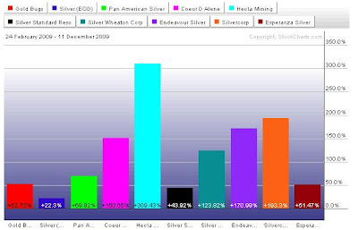
We will present two charts for for each category of stocks we list. The first chart is the "long term" chart. Depending on when some of the stocks listed became available publicly, the duration for the long charts varies dramatically. Please note the dates.
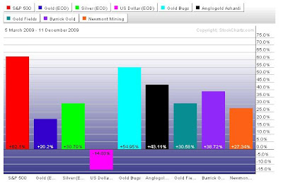
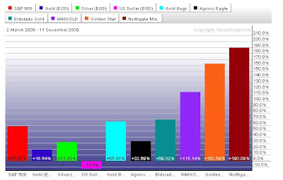
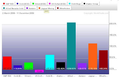
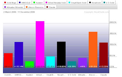
The second chart will be the same stocks since roughly the beginning of March, when the credit crisis ended and global stock markets (and gold prices) began recovering.
All charts are relative performance. Many companies are repeated in this analysis for various reasons, notably if they're part of one index or the next.
In this collection of charts, the "control group" is the HUI index, which can be proxy purchased through the GDX ETF. Keeping the HUI in the calculation means that all price measurements will be done relative to this index as a baseline.
Finally, note that this charting function we're using from stockcharts.com only allows the measurement of 10 ticker symbols at once. Thus, when we analyze a given index, we must do it over multiple charts, for which we again need a control price (like the HUI) so that we are consistently measuring apples vs. apples.
First, let's look at the performance of the major gold mining companies relative to the S&P, the end of day gold performance, the end of day silver performance, the USDX performance, and the HUI. First, note that gold stocks (as represented by the HUI) have outperformed the S&P consistently since 2001, which was, of course, the beginning of the gold bull market. Gold stocks have also outperformed gold itself (which has outperformed the S&P) and silver. Owning gold stocks is not a safe substitute for owning physical metal (which is insurance), but gold won't make you wealthier (you preserve your purchasing power only) while the right gold stocks will.
This is the primary reason we anticipate a very profitable 2010....
Here are the charts for some key large and intermediate producers, relative again to the S&P, the gold price, the silver price, the dollar index, and the HUI again. Note that this chart is from 2003 forward, but is plenty representative of the long term gold bull market.
Most recently, Buenaventura has been a strong outperformer. As a Brazilian company, much of that has probably been real currency appreciation vs. the dollar.
The next few charts show two sets of smaller producers over the long term and from March forward. Note that we had to break these into two sets of charts because of the number of companies in the list.
Since 2003, Eldorado Gold has been he best performer by far.
Since March...
The second group, from 2007:
Second group, since March:
Same group, since March:
Since March:
Set three:
Set 4--ok, maybe not really a set, but the last one of the lot...
An interesting mixed set, including some royalty companies, against the S&P, dollar, and HUI:











0 comments:
Post a Comment